Brochure Design for NextGen Pharma
Industry
Creative
Client
NextGen Pharma
Service
Editorial Design
Agency
InkPPT

Next Gen Pharma builds evidence-led products for serious clinical conditions. The work was a suite of communication leaflets — and the brief behind each was the same: take dense clinical evidence and make it land with a busy reader.
Pharma material is unusually hard to design. It arrives as mechanism-of-action detail, comparative trial data, regulatory language and clinical biology — all of which must stay accurate and become legible. Get it wrong and it reads as a wall of text; get it right and the evidence does the persuading. My work was the information design and layout that closed that gap across three very different therapy areas.
Two worlds that want each other, and never meet
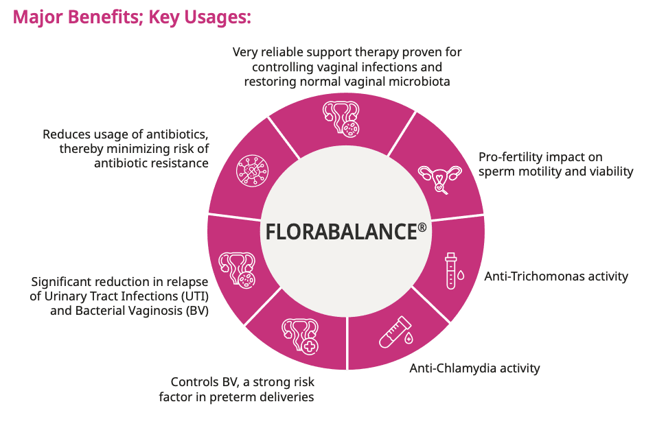
Women's Health : Florabalance
A probiotic for vaginal microflora. The challenge: sensitive biology and pathogen detail, communicated with clinical calm rather than discomfort.
Proctology : Roidosanal
A flavonoid therapy for haemorrhoids. The challenge: head-to-headtrial data made instantly comparable against a competing treatment.
Oncology Supportive Care : Mucofan
A lozenge preventing oral mucositis in cancer therapy. The challenge: high-stakes efficacy data, presented with seriousness and clarity.
A drug's mechanism is usually delivered as a list of actions. I rebuilt those lists as single radial diagrams — so the full picture of what a product does is held in one glance, not read line by line.


Trial data is where pharma communication usually collapses. The aim was a reader seeing the result in seconds — colour and structure doing the comparison, the numbers confirming it rather than carrying it alone.

Some of this content is clinically sensitive. The job was to art-direct anatomy and pathogenreference into a layout that stays calm, dignified and trustworthy — informative without ever becoming uncomfortable to look at.


