Branding Design for a Poet Brand
Industry
Publishing / Arts & Culture
Client
NA
Service
Branding Design
Agency
Self Project

Poetree turns private feeling into shared language. The brief was intimate by nature — it had to feel as personal as a handwritten letter, yet as considered as a published book. A small, soulful identity that could carry a poem card, a gift tag and a cover without ever raising its voice
Poetry resists branding. It is personal, unhurried and emotional, almost everything a conventional identity system is not. Packaging it risks flattening the very thing that makes it matter.
So the work wasn't to package poetry, but to build a quiet container for it: a mark that reads as both a written word and a living thing, and a system restrained enough to let the words stay the loudest part.
01
02
03
The name folds two ideas into one word — the poet and the tree. Poetry that grows like something living: every verse a branch, every reader a season of growth.
The identity follows the same logic as the name. A single mark where the act of writing and the act of growing become indistinguishable.

01
02
03

One deep green carries the entire emotional weight of the brand. Everything else simply gets out of the way, leaving room for the words.
#506747
#F4F1EA
#23281F

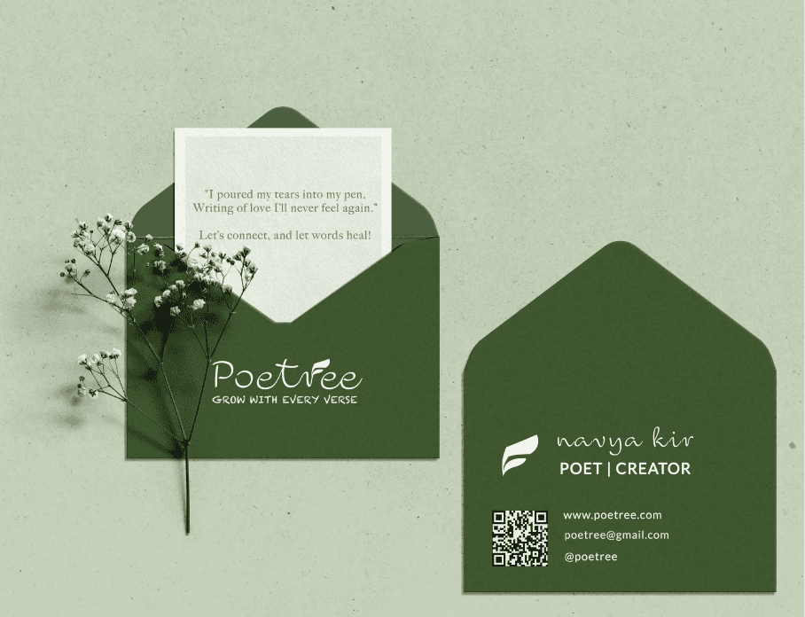
The business card takes the form of an envelope. Inside, a line of verse stands in for a tagline — so the brand introduces itself the way a poem does: quietly, and to the heart first.
The poetry book is where the brand becomes the thing it was always about — a quiet object you return to, the way you return to a feeling.


